A commonly-cited metric of economic progress is how many children are better off than their parents. In 2017, Raj Chetty and coauthors published a paper titled The Fading American Dream in which they argue that working Americans are far less likely to earn more than their parents than in previous generations. I recently saw the following chart from this paper in a presentation by Dr.Chetty:

On its face, this chart would seem to indicate that successive generations are earning less than their parents. A number of questions sprang to mind when I saw this chart. First, is it reasonable to expect that the vast majority of people can consistently earn more (adjusted for inflation) than their parents through time? A very high level of persistent economic growth would be required for this to be possible. If much of America was relatively poor in the 1940’s, it would not have been difficult for their children to earn more than they did. If, by contrast, much of America was relatively well-off following the massive expansion of the middle class in the 1950’s, it would have been quite difficult for the vast majority of children to be wealthier than their parents.
As I read through the paper that was the source for the chart above, I had even more questions. First, the data used for this chart is for 30-year-olds. Second, the analysis is for household income rather than for individuals (pre-tax family income, summing across spouses). The data used for the analysis is all adjusted for inflation, of course. With regard to the specific age chosen for the analysis, the question is how much of the shift in earning relates to increasing levels of education. Many young people today are early in their working careers at age 30 because they are spending longer in school. Knowing that this chart looks at household income, I also wonder how much the growth in two-income households skews the results. The paper addresses both of these questions. For the first, the authors show that the chart above looks about the same if we look at household earnings at age 40:

To address the issue of one- vs. two-income households, the authors created the same chart for just earnings of father vs. sons (Figure 3D in the paper) and the trend is even more extreme.
The next piece of the problem, from my perspective, is to understand the shifts in income in more absolute terms. The narrative goes as follows. The kids born in 1940 (the 1940 birth cohort) grew up, were educated, and started work during the post-WWII decades, a period of enormous growth and prosperity in America. It should not be surprising that they were highly likely to earn more than their parents did. Once affluence reaches a certain level, however, it is not sensible to assume that the next generation will also enjoy a similar relative jump in income. To explore this issue, Chetty el al show the probability distributions of parent vs. child income for the people born in 1940 (the 1940 birth cohort) and for those born in 1980. The parents of the 1940 birth cohort had a mode ( the peak of the distribution, which equates to the most likely value) of less than $20,000 dollars (this is all adjusted to 2014 values). This is incredibly low by modern standards. The kids’ households had a mode of more than $50,000. As noted in the chart below, $27,000 in household income was at the 80th percentile for the parents’ income but only the 14th percentile for the kids. This chart also illustrates that there was a much greater range of incomes for the kids (the distribution is wider).


The incomes for the 1980 birth cohort and their parents are vastly different than for the 1940 birth cohort. The 80th percentile income for the parents of the 1980 birth cohort is $80,000, more than 2.5 times the same percentile of income for the parents of the 1940 birth cohort. The parents of the 1980 birth cohort are vastly wealthier than those of the 1940 birth cohort, so it should not be surprising that a smaller percentage of kids in the 1980 birth cohort earned more than their parents. What is perhaps most striking about the incomes of the 1980 birth cohort is the higher dispersion of incomes (the distribution is much wider) as compared to the 1940 birth cohort.
The mode of income for the 1980 birth cohort appears to be between $25K and $30K. This is well below the mode of their parents’ income, at about $52K, but is still markedly higher than that of the parents of the 1940 cohort. At the higher percentiles, the children of the 1980 birth cohort earn considerably more than their parents. The 80th percentile of the parent’s income corresponds to the 74th percentile of the kids’ income, for example.
The range of incomes for the 1980 birth cohort is much greater than for their parents or for the 1940 birth cohort or their parents. This dispersion illustrates rising inequality. The better-educated and advantaged kids have access to higher paying jobs, while the kids of working class are less upwardly mobile. The span of the data may be showing us more about an anomalous highly-advantaged generation, the Boomers, than about long-term trends.
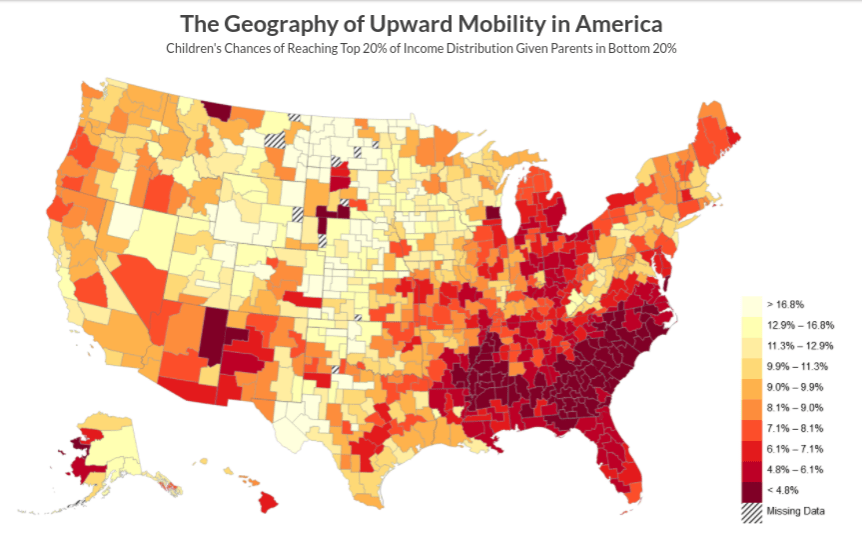
One of the common ways to illustrate growing income inequality and social mobility is to look at the probability that a child born in the poorest 20% of households can make it to the highest 20%. The chart below, for example, shows the geographic distribution economic mobility using this measure. This chart uses quintiles for national distributions of income rather than local income.
Let’s estimate that the top 20% of income for the 1980 birth cohort starts at $90,000 and is $80,000 for the 1940 birth cohort (all dollar amounts expressed in terms of inflation-adjusted dollars). These are approximations because of the limitations of the reading values from these charts. You have to earn more today, in real terms, to make it to the top 20% than in previous generations. There will be a group of people today who would have been in the top quintile if measured against previous generations but who are not in the top quintile when compared to others in their generation.
In summary, we have to be very careful in how we interpret these types of statistical data. The percentage of kids earning more than their parents is, in my opinion, simply not a good measure of economic progress. What we can see, unequivocally, from the data are that (1) the generation born in 1940 enjoyed an unusually prosperous economic landscape, and (2) the distribution of income between American households has spread dramatically. The idea that the majority of people in each successive generation should expect to earn more than their parents is neither reasonable nor desirable from a policy standpoint. In a mature post-industrial economy, it makes sense that roughly half of kids will earn more than their parents and half will earn less. The wide distribution of incomes in the 1980 birth cohort, with the mode of income below that of their parents (the final chart in this post), demonstrates increasing inequality (consistent with lots of other analysis) but using the chart at the beginning of this post to argue the ‘fading of the American dream’ is problematic. In a resource-constrained world, suggesting that every generation can and should expect to be wealthier than their parents is not a good foundation for policy.
