Trend-following models have a long history in portfolio management, and there is solid evidence that these strategies can provide risk-adjusted return that is above a buy-and-hold approach. The simplest approach to trend following is to buy when the price of an asset class (as represented by an index fund, for example) rises above the trailing 10-month moving average (MA) of price and sell when the price falls below the 10-month MA. The benefits of following something like the 10-month MA are quite robust. In practice, this kind of simple trend following requires care. In some circumstances, the price can cross the trailing MA repeatedly over a short period of time, resulting in quite a bit of churn and, potentially, in unpleasant tax outcomes. This situation can result in a series of losing trades in which you sell low (after the price has dropped) and buy high (as the prices recovers).
After a long bull market, many investors are concerned about a decline and the massive market crash in 2008 remains a vivid reminder of how quickly things can change. In this article, I compare the evolution of trends in the S&P 500 at the end of November 2007 and the end of November 2019. In late 2007, trend analysis suggested that the market was starting a correction. In late 2019, things look very different.
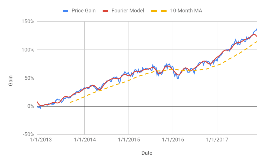
While I am not a huge fan of mechanically following simple trend models, looking at prices relative to various trend measures can provide insight into the state of the market. Consider, for example, the 5-year price chart of the S&P 500 ETF, SPY, as of the end of November 2007 (below). In this and subsequent charts, I am using weekly-resolution prices (not including dividend adjustments). At the end of November of 2007, SPY had crossed below its 10-month MA. Over the preceding five years, SPY had repeatedly dropped below its 10-month MA a number of times and then bounced back above. In econometric terms, there was substantial high-frequency variation about the trend. In November 2007, however, SPY had fallen further below the 10-month MA than in recent crossovers.

Along with the MA trend, the chart above also shows a trend model derived from Fourier analysis. The application of Fourier theory in this context is to identify specific time scales of variability that best fit the data. Rather than assuming a specific time scale (such as ten months), the Fourier analysis fits trend based on the the predominant times scales in the sample period ( five years). At the end of November 2007, the price of SPY had dropped below the smoothed price established by the Fourier model. More importantly, the Fourier trend was sloping downward at this time, suggesting further decline. 2008 turned out to be one of the worst years in market history and the declines in late 2007 provided a warning that the market had turned.
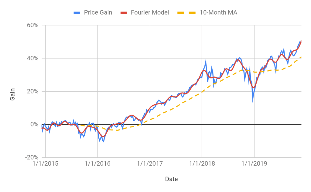
Now let’s look at the same type of chart at the end of November of 2019 (below). Over the most-recent five-year period, the price of SPY is up by about 50% (again, we are ignoring dividends), similar to the five-year price gains in November 2017, but the shape of the trend is very different today. Specifically, SPY is well above its 10-month MA and the Fourier-based trend is sloping upwards, both of which suggest that the U.S. market is in an established upward trend.
Trend analysis can be described as separating the high-frequency (short timescale) variability in data from the low-frequency (longer timescale) signal, which is the part that tends to be persistent. The high-frequency / short timescale component of data tends to be the noise, the part that cannot be forecast. Moving averages provide a simple way to separate the low-frequency / trend from the high-frequency components of a price chart. The Fourier analysis does largely the same thing, although the Fourier trend contains multiple timescales, determined by the data. There is no predictive silver bullet in any of this–just a way to look at the evolution of the trends through time.
The contrast between the trend analysis in November 2007 and in November 2019 is dramatic. In late 2007, the market price of SPY had crossed substantially below the 10-month MA and the Fourier trend was pointing towards further declines. Today, SPY is well above the 10-month MA and the Fourier trend points toward further gains.
There are many reasons for caution in the current market: a very long bull market, high stock valuations (PE10 above 30), and 28% gains for SPY YTD. Even so, the robust current trend suggests remaining invested in U.S. equities. When the market does turn, and it can revert quickly, it is wise to have thought through what you will do–hang on or sell if a negative trend is established. Trend-based methods provide objective sell discipline and that consistency is a crucial element in managing losses.
Addendum
As an additional reference case, the chart below shows the same analysis applied to the end of November of 2017. In 2018, SPY returned about -4.5% (including dividends). I am including this case because SPY was well above the 10-month MA at this time, but the Fourier model suggested that a decline was in the works. Note that the Fourier model was turning down, even though the actual price of SPY was at a high. The Fourier model suggests that the market was trending down but short-term noise had pushed it temporarily higher.